machine learning for finance - first steps
16 Apr 2021I just finished a book called Advances in Financial Machine Learning, by Marcos López de Prado. It’s a dense book and I struggled with some of the chapters. Putting what I learned into practice (and explaining it in my own words) may help me grasp it better, so here it is. (Also, I thought it would be fun to try de Prado’s ideas on data from Brazil.) In this post I put into practice the idea of dollar bars (chapter 2). In the next post I will do fractional differencing (chapter 5). In later posts I want to do meta-labeling (chapter 3), backtesting with combinatorial cross-validation (chapter 12), and bet sizing (chapter 10).
basic idea
We normally think of time series data in terms of, well, time. In most time series each t is a day or a minute or a year or some other measure of time. But t can represent events instead. For instance, instead of t being 24 hours or 30 days or anything like that, it can be however long it takes for 100 people to walk by your house.
Let’s make that (admittedly silly) example more concrete. You wait by the window of your living room and start counting. It takes two hours for 100 people to walk by your house. You note that 28 of them were walking with dogs (let’s say that’s what you’re interested in). That’s it, you’ve collected your first sample: \(y_{t1}\) = 28/100 = 0.28. You start counting again. This time it takes only 45 minutes for another 100 people to walk by your house. 42 of them had dogs. That’s your second sample: \(y_{t2}\) = 42/100 = 0.42. And so on, until you have collected all the samples you want. The important thing to note here is that your t represents a variable amount of time. It’s two hours in the first sample but only 45 minutes in the second sample.
In finance most time series are built the conventional way, with t representing a fixed amount of time - like a day or an hour or a minute. de Prado shows that that creates a number of problems. First, it messes up sampling. The stock market is busier at certain times than others. Consider for example BOVA11, which is an ETF that tracks Brazil’s main stock market index (Ibovespa). This is how BOVA11 activity varied over time on April 12th, 2021:
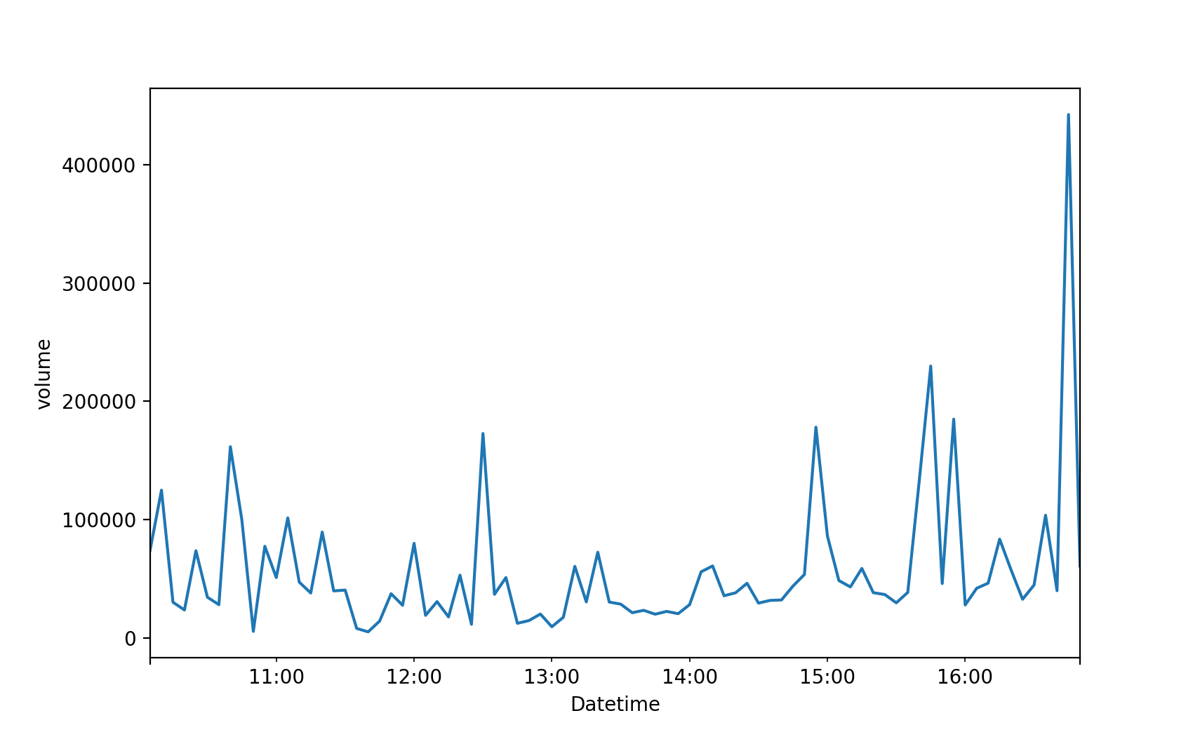
As we see, some times of the day are busier than others. If t represents a fixed amount of time - 1 hour or 15 minutes or 5 minutes or what have you - you will be undersampling the busy hours and oversampling the less active hours.
The second problem with using fixed time intervals, de Prado says, is that they make the data more serially correlated, more heteroskedastic, and less normally distributed. That may hurt the predictive performance of models like ARIMA. (I wonder whether those problems also hurt the performance of non-parametric models like random forest. The statistical properties of your coefficients can’t be affected when you have no coefficients. But I leave this discussion for another day.)
The solution de Prado offers is that we allow t to represent a variable amount of time - like in my silly example of counting passers-by. More specifically, de Prado suggests that we define t based on market activity. For instance, you can define t as “the time it takes for BOVA11 trades to reach R$ 1 million” (R$ is the symbol for reais, the currency of Brazil.) Say it’s 10am now and the stock market just opened. At 10:07 someone buys R$ 370k of BOVA11 shares. At 11:48 someone else buys another R$ 520k. That’s R$ 890k so far (370k + 520k = 890k). At 12:18, more R$ 250k. Bingo! The R$ 1 million threshold has been reached (370k + 520k + 250k = 1140k). You collect whatever data you are going to use in your model and you have your first sample. Say that you’re interested in the closing price and that it was R$ 100 at 12:18, when the R$ 1 million threshold was triggered. Then your first sample is \(y_{t1}\) = 100. You now wait for another R$ 1 million in BOVA11 trades to happen, so you can have your second sample. And so on.
In reality you don’t “wait” for anything, you look at past data and find the moments when the threshold was reached and then collect the information you want (closing price, volume, what have you).
You can collect more than one piece of information about each sample. Maybe you want closing price, average price, and volume. In that case your \(y_{t1}\) will be a vector of size 3 (as opposed to a scalar). In fact that is more common than collecting a single feature. And finance people often visualize each sample in the form of a “candlestick bar”, like this:

That’s why finance folks talk about “bars” instead of “samples” or “observations”. When the bars are based on fixed time intervals (5 minutes or 1 day or what have you) we call them “time bars”. When they are based on a variable amount of time that depends on a monetary threshold (like R$ 1 million or US$ 5 million) we call them “dollar bars”. (Apparently people call it “dollar bars” even if the actual currency is reais or euros or anything else.)
When you have collected all the samples (“bars”) you want you can use them in whatever machine learning model you choose. Suppose those samples are your y - the thing you want to predict. In that case you will normally want your X - your features - to be based on the same time intervals. In the example above our first sample corresponds to the interval between 10:00 and 12:18 of some day. Say you’re using tweets as one of your features. You will need to collect tweets posted between 10:00 and 12:18 of that same day. Suppose that it took two hours for another R$ 1 million in BOVA11 trades to happen. Then you will need to collect tweets posted between 12:18 and 14:18 of that day. And so on, until you have time-matching X data points for each y data point.
de Prado suggests other types of market-based bars, like tick bars (based on a certain number of trades) and volume bars (based on a certain number of shares traded). Here I’ll stick to dollar bars. Also, to keep things simple I will collect a single feature (closing price) from each sample.
how to make dollar bars
Ok, how do we create dollar bars with real-world data?
First snag: getting the data is hard. Brazil’s main stock exchange, B3, only publicizes daily data. That gives us, for each day and security, highly aggregated information like closing price and total volume. Ideally we would want intraday data - all that same information, but for each 1-minute interval or 5-minute interval. It’s not that I want to do high-frequency trading, it’s just that with intraday data I can train a wider range of models.
(Just to clarify: the goal here is to make dollar bars, not time bars. But I need time bars to build dollar bars.)
Yahoo Finance does give us intraday data (that’s how I got the data for the BOVA11 volume plot above), but only for the last 60 days. That means your models will give a lot of weight to whatever quirks the market experienced over the last 60 days.
You can subscribe to data providers like Economatica, which gives you intraday data going back many years. But that costs about US$ 5k a year. Hard pass. I don’t want to lose money before I even do any trading. I want to lose money after I’ve trained and deployed my models, like the pros.
A friend suggested that I look into trading platforms like MetaTrader. I tried a bunch of them and they do have intraday data, but going back only a couple of weeks. And you can’t download the data, you can only use it online.
So for the time being I settled for the over-harvested, low-frequency data that B3 gives us mortals. More specifically, I downloaded BOVA11 daily data from Dec/2008 through Dec/2020. I saved the CSV file here.
The REAIS column is the amount in R$ of BOVA11 trades each day. That’s what I need to use to build dollar bars here. Which brings us to the question: if I’m defining t as “the time it takes for BOVA11 trades to reach R$ threshold”, what should threshold be? (Let’s call that threshold T from now on.)
Another question is: should T be a constant? On 2008-12-02, when our time series starts, R$ 2.6 billion in BOVA11 shares were traded. But on 2020-12-22, when our time series ends, R$ 59 billion in BOVA11 shares were traded. That’s 20 times more money (not accounting for inflation; by the way I’m completely ignoring inflation in this post, to keep the math simple; if you’re doing this with real $ at stake you probably want to adjust all values for inflation). Suppose we make T a constant and set it to, say, R$ 2 billion. For most of 2010-2020, BOVA11 trade exceeds R$ 2 billion per day. But I don’t have intraday data here, so most days would trigger the R$ 2 billion threshold and generate a new dollar bar. We would basically just replicate the time bars, in which case we gain nothing. On the other hand, if we make T a constant and set it to, say, R$ 200 billion, then the initial years will be reduced to just two or three samples. What to do?
I experimented with several constant values of T, to see what would happen. I tried a bunch of numbers from as low as R$ 300 million to as high as R$ 100 billion. In all cases there was no improvement in the statistical properties of BOVA11 returns, which is the main thing I’m trying to achieve here.
Hence I chose to make T vary over time. For each day in the sample I computed the 253-day moving average of the “dollar” column (REAIS). I chose 253 days because that’s the approximate number of trading days in a year. I then found all the days where that moving average accumulated 25% (or more) growth. Finally, I took each pair of such days and computed the average “dollar” amount (the REAIS column) of the interval between them - and I set T to that average for that interval.
Take for instance 2009-12-10, which is the first day for which we have a moving average (each moving average is based on the preceding 253 days; that means we have no moving averages for the first 253 days of the time series). The 2009-12-10 moving average is R$ 1.5 billion. A 25% growth means R$ 1.875 billion. That amount was reached on 2010-04-29, when the moving average was R$ 1.917 billion. The average REAIS column for the interval between 2009-12-10 and 2010-04-29 is R$ 1.8 billion. Voilà - that’s our threshold for that interval. I did the same for the rest of the time series. The result was the following set of thresholds.
| starting date | threshold (billion R$) |
|---|---|
| 2009-12-10 | 1.8 |
| 2010-04-29 | 2.4 |
| 2011-02-09 | 3.4 |
| 2011-08-08 | 6.2 |
| 2011-10-27 | 6.5 |
| 2012-02-07 | 11.4 |
| 2012-04-10 | 16.4 |
| 2012-05-24 | 10.8 |
| 2012-08-29 | 9.9 |
| 2015-09-02 | 14.7 |
| 2016-08-08 | 18.1 |
| 2018-03-01 | 24.5 |
| 2018-10-26 | 41.2 |
| 2019-02-20 | 41.0 |
| 2019-07-25 | 50.7 |
| 2020-01-29 | 122.0 |
| 2020-03-23 | 111.7 |
| 2020-06-12 | 92.2 |
| 2020-10-29 | 107.5 |
In the end what I’m trying to do here is to identify the moments when the REAIS column grows enough to need a different T. Now, those choices - 253 days, 25% growth - are largely arbitrary. We could play with different numbers to see how that affects the results. We could also replace the “25% growth” rule with a “25% change” rule, to allow for periods when the stock market goes south. Or we could get more rigorous and use, say, the Chow test to spot structural breaks in the REAIS series. Or - if we had a particular model in mind - we could try to learn those numbers from the data. But for now I’m going with arbitrary choices. Sorry, reviewer 2.
le code
Enough talk, time to work.
There is a Python package called mlfinlab that creates dollar bars and implements other de Prado ideas. But I wanted to do this myself this first time. So here is my code:
import pandas as pd
from matplotlib import pyplot as plt
from matplotlib.patches import Rectangle
from scipy.stats import normaltest
from statsmodels.stats.diagnostic import acorr_ljungbox
from sklearn.preprocessing import StandardScaler
from sklearn.preprocessing import PolynomialFeatures
from sklearn.linear_model import LinearRegression

# load data
df = pd.read_csv('bova11.csv')

# fix date field
df['DATAPR'] = pd.to_datetime(df['DATAPR'], format = '%Y-%m-%d')

# sort by date
df.index = df['DATAPR']
del df['DATAPR']
df = df.sort_index()

# keep only some columns
df_cols = [
    'PREULT', # closing price
    'REAIS', # total R$ in BOVA11 trades
    'PREMIN', # minimum price
    'PREMED', # average price
    'PREMAX'  # maximum price
    ]
df = df[df_cols]

# compute moving averages
window_length = 253
ma = df['REAIS'].rolling(window_length).mean().dropna()

# find days when the moving average
# accumulated 25% growth or more
current_ma = ma[0]
cutoffs = [ma.index[0]]
for i in range(len(ma)):
    if ma[i] / current_ma > 1.25:
        cutoffs.append(ma.index[i])
        current_ma = ma[i]
cutoffs.append(ma.index[-1])

# drop days without a moving average
df = df[cutoffs[0]:]

# compute thresholds
df['threshold'] = None
for i in range(len(cutoffs)):
    if i == len(cutoffs) - 1:
        break
    t0 = cutoffs[i]
    t1 = cutoffs[i + 1]
    avg = df[t0:t1]['REAIS'].mean()
    df.loc[t0:t1, 'threshold'] = int(avg)

# make dollar bars
cumsum = 0
bars = []
for row in df.iterrows():
    threshold = row[1]['threshold']
    cumsum += row[1]['REAIS']
    if cumsum >= threshold:
        t = row[0]
        closing_price = row[1]['PREULT']
        bars.append((t, closing_price))
        cumsum = 0
bars = pd.DataFrame(bars)
bars.columns = ['date', 'closing_price']
bars.to_csv('bars.csv', index = False)
The result is a total of 1707 dollar bars. They look like this:
| date | closing price (in R$) |
|---|---|
| … | … |
| 2015-12-16 | 4374 |
| 2015-12-17 | 4374 |
| 2015-12-18 | 4258 |
| 2015-12-22 | 4223 |
| 2015-12-23 | 4275 |
| 2015-12-29 | 4242 |
| 2016-01-04 | 4110 |
| 2016-01-06 | 4050 |
| 2016-01-08 | 3934 |
| 2016-01-12 | 3838 |
| … | … |
(Ideally the closing price should be the price you collect the moment your threshold T is reached. But I don’t have intraday data, only daily data. Hence the closing price in each dollar bar here is the closing price of the day each bar ends.)
With time bars we would have 2983 samples, as we have 2983 trading days in our dataset (2008-12-02 through 2020-12-22). By using dollar bars we shrinked our sample size by 42%, down to 1707. That’s a steep price to pay. It’s time to see what we got in return.
The sampling issue has been reduced by construction, there isn’t much to show here. With time bars we would have an equal number of samples from low-activity years, like 2010, and from high-activity years, like 2020. With dollar bars we sample less from low-activity years and more from high-activity years. We still have some degree of over- and under-sampling, since we made T variable, but certainly less than what we would have with time bars.
Have we made BOVA11 returns more normal by using dollar bars? Here is the code to check that:
## check if dollar bars improved normality
# testing and plotting parameters
alpha = 1e-3
rnge = (-500, 500)
bins = 100
# time bars
y1 = df['PREULT'].diff().dropna().values
k2, p = normaltest(y1)
print('p:', p)
if p < alpha:
print('null rejected')
else:
print('null not rejected')
df['PREULT'].diff().hist(
bins = bins,
range = rnge,
histtype = 'step',
color = 'blue'
)
# dollar bars
y2 = bars['closing_price'].diff().dropna().values
k2, p = normaltest(y2)
print('p:', p)
if p < alpha:
print('null rejected')
else:
print('null not rejected')
bars['closing_price'].diff().hist(
bins = bins,
range = rnge,
histtype = 'step',
color = 'orange'
)
# add legend
handles = [Rectangle((0,0),1,1,color=c,ec="k") for c in ['blue', 'orange']]
labels = ['using time bars', 'using dollar bars']
plt.legend(handles, labels)
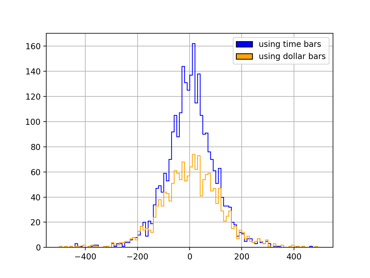
plt.show()The null hypothesis here is that the distribution is normal. It is rejected in both cases: neither time bars (p=1.3e-250) nor dollar bars (p=1.5e-125) produce normal returns. But with dollar bars we do get a more normal-looking, less “spiky” distribution:
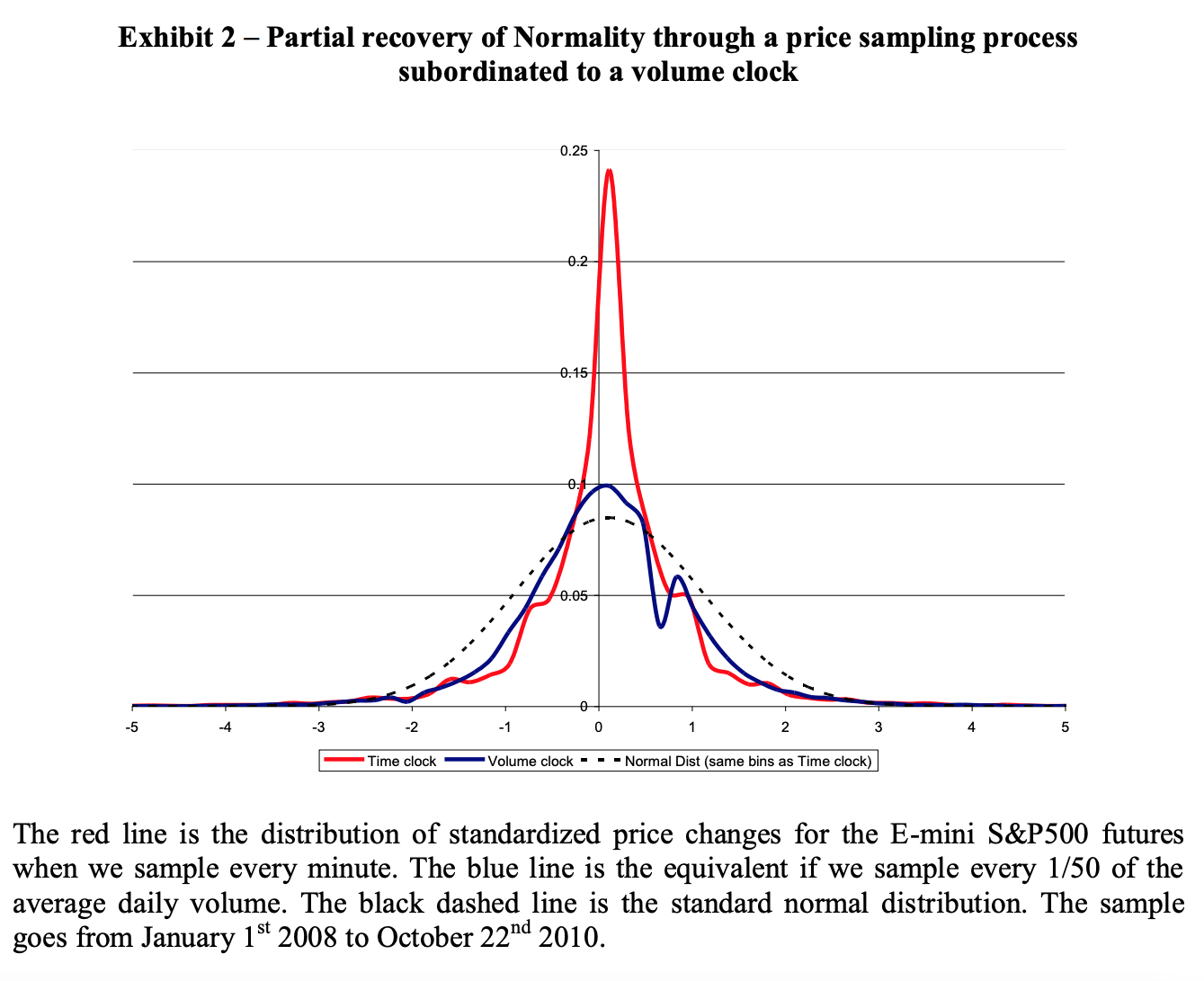
That is similar to what de Prado finds in one his papers (The Volume Clock: Insights into the High Frequency Paradigm, from 2019, on p. 17):
On to autocorrelation. Here is the code:
## check if dollar bars reduced autocorrelation
# set number of lags
lags = 10 # same as de Prado uses
# time bars
y1 = df['PREULT'].values
ac_test = acorr_ljungbox(y1, lags = [lags])
print(ac_test)
# dollar bars
y2 = bars['closing_price'].values
ac_test = acorr_ljungbox(y2, lags = [lags])
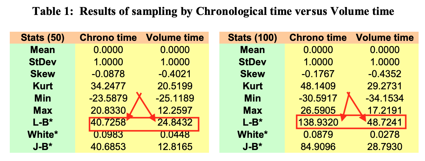
print(ac_test)The null hypothesis of zero autocorrelation is rejected in both cases, but the Ljung–Box test statistic is lower with dollar bars (16226) than with time bars (26440). This is similar to what de Prado finds in another of his papers (Flow Toxicity and Liquidity in a High Frequency World, from 2010, on p. 46):
Finally, heteroskedasticity. de Prado (in the same 2010 paper I just mentioned) uses White’s heteroskedasticity test, where you regress your squared residuals against the cross-products of all your features. In the absence of heteroskedasticity the resulting R2 multiplied by the sample size (n) follows a chi-square distribution (with degrees of freedom equal to the number of regressors.)
Now, de Prado has no residuals. He is just building a vector of data to be used in some model later on, same as we are here. So how the heck did he run White’s test? Well, he simply substituted the returns themselves for the residuals. He squared the (standardized) returns and regressed them “against all cross-products of the first 10-lagged series” (p. 46).
I have no idea what the implications of that workaround are. For instance, what if I don’t use an autoregressive model in the end? Maybe with exogenous features I would have no heteroskedasticity to begin with, or maybe I would have heteroskedasticity but the dollar bars wouldn’t help. Heteroskedasticity is a function of the model we are using; as Gujarati notes:
Another source of heteroscedasticity arises from violating Assumption 9 of the classical linear regression model (CLRM), namely, that the regression model is correctly specified. […] very often what looks like heteroscedasticity may be due to the fact that some important variables are omitted from the model. Thus, in the demand function for a commodity, if we do not include the prices of commodities complementary to or competing with the commodity in question (the omitted variable bias), the residuals obtained from the regression may give the distinct impression that the error variance may not be constant. But if the omitted variables are included in the model, that impression may disappear. (Basic Econometrics, p. 367)
Some Monte Carlos might be useful here. We could generate synthetic price data, get the returns, see what happens to the variance of the residuals under different model specifications, and see how heteroskedasticity affects predictive performance. But that’s more work than I’m willing to put into this blog post. Also, de Prado’s algorithms are in charge of Abu Dhabi’s US$ 828 billion sovereign fund. With that much skin in the game he probably knows what he is doing. (On top of that, he has an Erdős 2 and an Einstein 4.) So here I choose to just trust de Prado. Sorry again, reviewer 2.
Here’s the code:
## check if dollar bars reduced heteroskedasticity

# (statsmodels' het_white method returns an
#  assertion error, so I had to do it "manually")

def check_het(df, price_col):
    lags = 10 # same as de Prado used

    # get returns
    df['DIFF'] = df[price_col].diff()

    # standardize returns
    scaler = StandardScaler()
    df['DIFF'] = scaler.fit_transform(df['DIFF'].values.reshape(-1, 1))

    # square standardized returns
    df['DIFF'] = df['DIFF'].map(lambda x: x ** 2)

    # make lags
    for lag in range(1, lags + 1):
        df['LAG_' + str(lag)] = df['DIFF'].shift(lag)
    df = df.dropna()
    y1 = df['DIFF'].values
    x1 = df[[e for e in df.columns if 'LAG' in e]].values

    # make cross-products
    poly = PolynomialFeatures(2, include_bias = False)
    x1 = poly.fit_transform(x1)

    # regress
    reg = LinearRegression()
    reg.fit(x1, y1)
    R2 = reg.score(x1, y1)

    return x1.shape[0] * R2, x1.shape[1]

# time bars
test_stat, n = check_het(df, 'PREULT')
print(test_stat, 'w/', n, 'degrees of freedom')

# dollar bars
test_stat, n = check_het(bars, 'closing_price')
print(test_stat, 'w/', n, 'degrees of freedom')
In both cases we reject the null hypothesis of homoskedasticity, but the test statistic is lower with dollar bars (1412) than with time bars (2351). (The degrees of freedom are the same in both cases.) Once more we have a result that is similar to what de Prado found (same 2010 paper as before, same table):
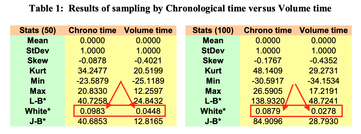
(Just for clarity, what de Prado is reporting in this table is the R2 of White’s regression, not White’s test statistic. But the test statistic is just the R2 multiplied by the sample size, which in de Prado’s case is the same for both the time bar series and the dollar bar series. I report the test statistic in my own results because, unlike him, I have different sample sizes.)
was it all worth it?
That’s a hard question to answer because I’m not training any models here. All I have to go by so far are the statistical properties of the BOVA11 returns, which appear to have improved. But does that mean an improvement in predictive performance? I won’t know until I get to the modeling part. So my answer is “stay tuned!”